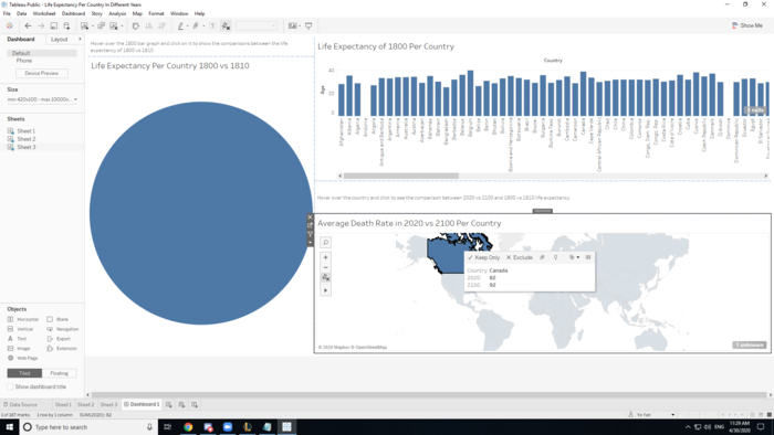
When you click on a country on the 2020 vs 2100 life expectancy graph, the 1800 vs 1810 life expectancies circle graph isolates the same country that you clicked on the 2020 vs 2100 life expectancy graph.
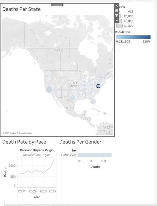
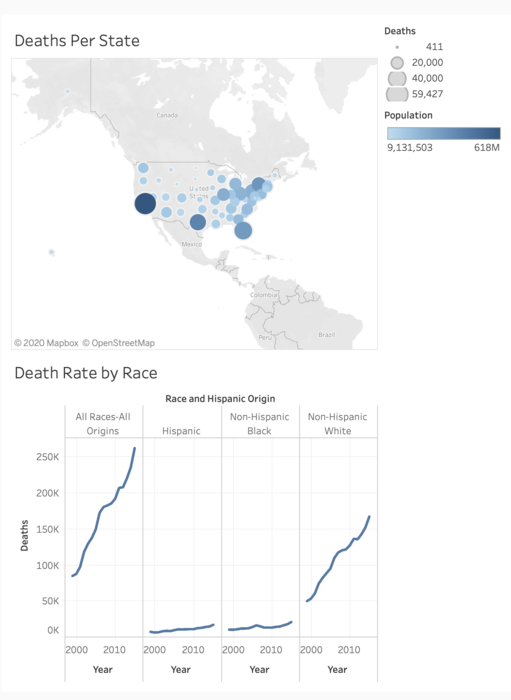
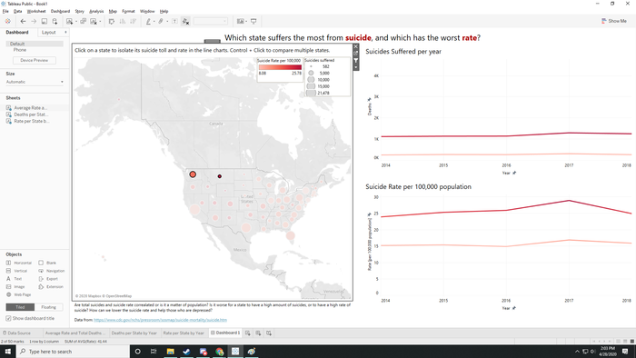
When Clicking on the map the data of the graph adjusts to the state that has been highlighted
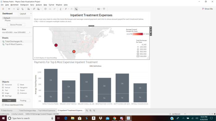
Clicking on one of the states isolates it in the chart below and shows the cost spent on each of the six treatments. Holding CTRL and clicking on other states makes it easy to compare multiple states
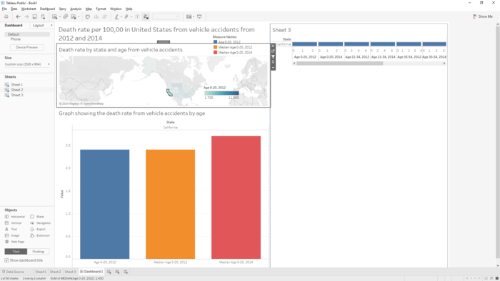
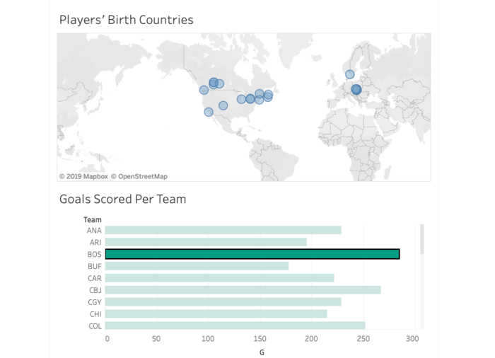
Clicking on the dots on each state will isolate the corresponding lines on the line charts (because highlighting would still end up with some highlighted lines being covered by the non-highlighted lines) and hovering will attempt to highlight the corresponding lines.
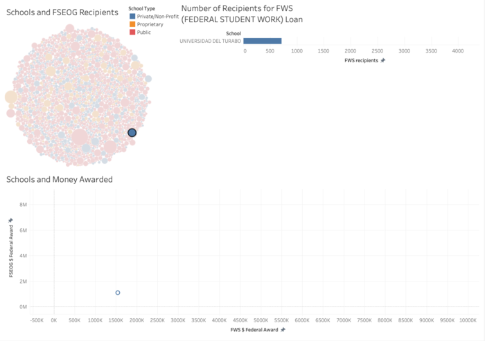
when you click on a bubble in the bubble chart, it will filter/link into the other graphs, which shows # recipients and amount of $ received
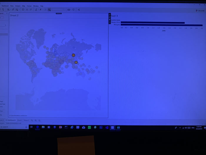
After selecting any two dots on the map, it shows a comparison of annual urban population growth between two countries
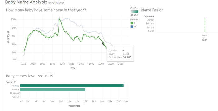
Interaction of Baby Names

 ye_yan
Almost 6 years ago
ye_yan
Almost 6 years ago
 jchris
Almost 6 years ago
jchris
Almost 6 years ago
 joel-manesh
Almost 6 years ago
joel-manesh
Almost 6 years ago
 jped
Almost 6 years ago
jped
Almost 6 years ago
 4aron
Almost 6 years ago
4aron
Almost 6 years ago