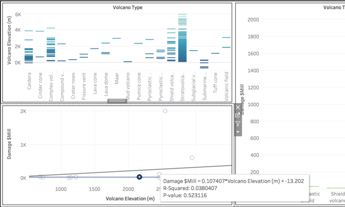
This is showing a trend line of an association existing between volcano type elevation and damage cost
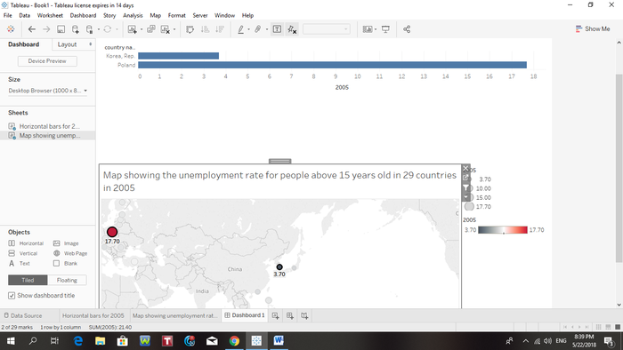
Map is linked to both charts.
Selecting any two of the dots on the map will reveal a horizontal bar chart comparison between the two selected countries.
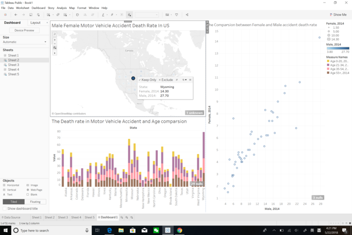
The death rate in car accident with only Wyoming State selected on the map
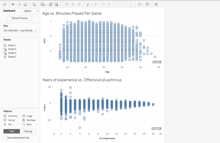
Age vs. minutes played per game and years of experience vs. offensive plus/minus.
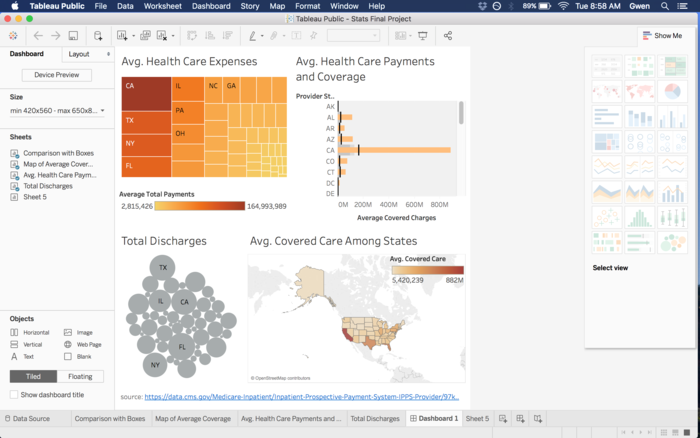
Display of total discharges, avg. health care payments, and coverage among states
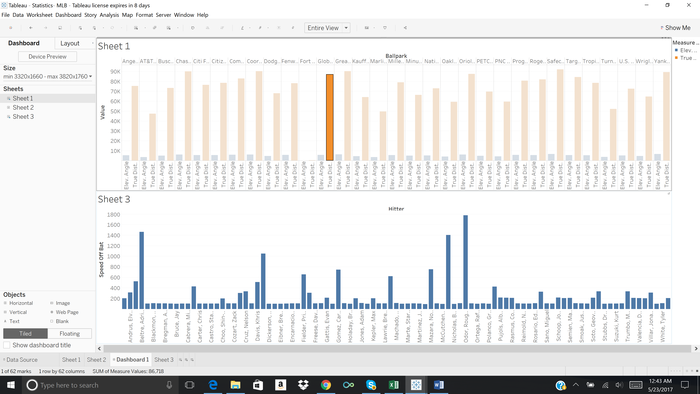
An interactive dashboard, where you can select a ballpark, and it will give you the corresponding hitters that hit homeruns and bat speed.
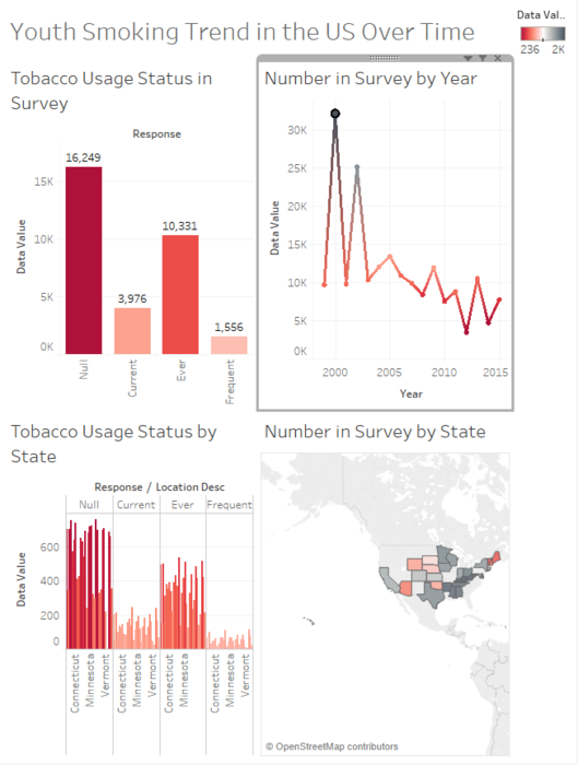
In the dashboard, only data for the year 2000 is being observed. The year is selected by the line graph in the top right.

 annagetrekt
Over 7 years ago
annagetrekt
Over 7 years ago
 elaine-chi
Over 7 years ago
elaine-chi
Over 7 years ago
 david-liao
Over 7 years ago
david-liao
Over 7 years ago
 ericdang
Over 8 years ago
ericdang
Over 8 years ago
 gwendolyn-chu
Over 8 years ago
gwendolyn-chu
Over 8 years ago