Sign up
Sign in
tableau
/
Data-Visualization-Interactive-Dashboard
/
u
/
Ye_Yan
/
Post #4
Ye Yan
Tableau Public Interactive Dashboard
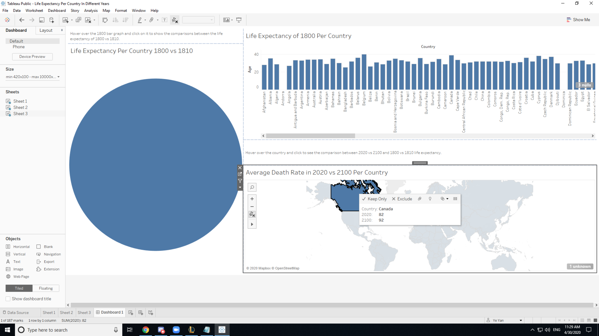
When you click on a country on the 2020 vs 2100 life expectancy graph, the 1800 vs 1810 life expectancies circle graph isolates the same country that you clicked on the 2020 vs 2100 life expectancy graph.
April 30, 2020 at 11:35 AM
Last updated almost 6 years ago
Visible to public
×
Insert an image
Image URL
Upload an image
Use
PostImage.org
to upload the image
Copy the
Direct Link
to your clipboard and paste it into the box above
Heading
Section
New version available
Refresh
Dismiss

 Ye Yan