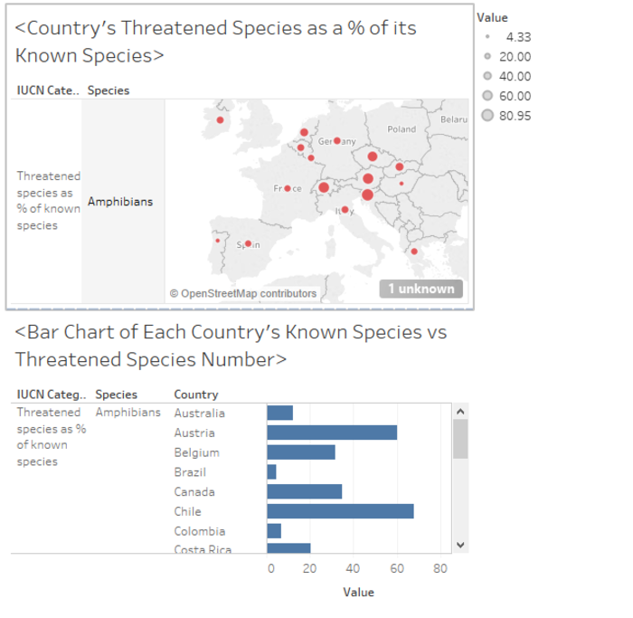
a visualization of the data
Click on a country to see individual percentages. Ctrl +Click on a additional countries to compare percentages across a bar chart.
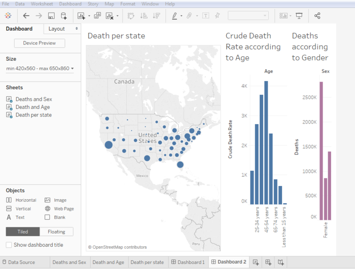
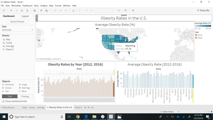
Hovering over a specific state on the map will highlight the corresponding data in the bar charts for average obesity rate and rate by year.
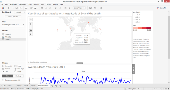
Clicking on a point in the first graph will filter out the points on the map that corresponds to the date on the graph
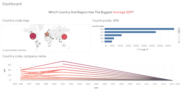
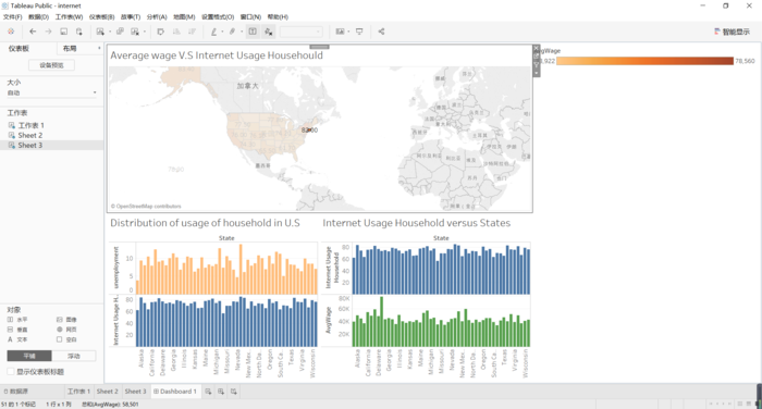
the Dashboard that can compare the Internet Usage Household, Average Wage, and Unemployment rate.
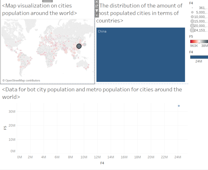
In this dashboard, I demonstrate how each sheet is interact with others.By clicking the city Shanghai, each sheet give the specific data about this particular city.
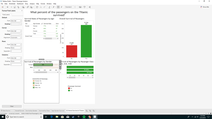
All the charts are linked together by selecting the data.
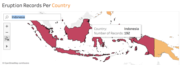
You can search for the country you are interested in on the map. By hovering over/ clicking on the country, you can see its eruption history

 allen
Over 7 years ago
allen
Over 7 years ago
 kwiens
Over 7 years ago
kwiens
Over 7 years ago
 anthonyyeh28
Over 7 years ago
anthonyyeh28
Over 7 years ago
 jordan-liu
Over 7 years ago
jordan-liu
Over 7 years ago