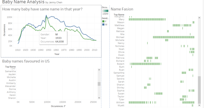
the graph will show the exact number that baby have the same names in that year
Click on a bar and the dot corresponding with/representing that property type will change color.
Click on the Bubble and the dot representing that city will change color.
This dashboard is interactive.
You are able to click on the trendline for a specific year and a specific gender to see all of the boys and girls for the specific year and the counts for each name for that year.
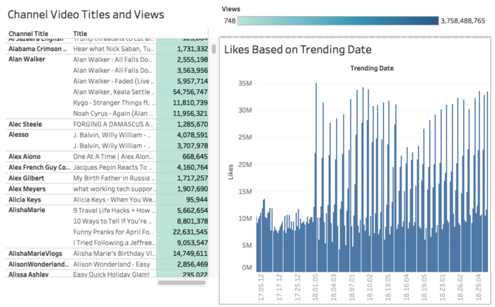
When hovered over green, it shows channel name, video title, and views. When hovered over blue bars, it shows number of views and trend date
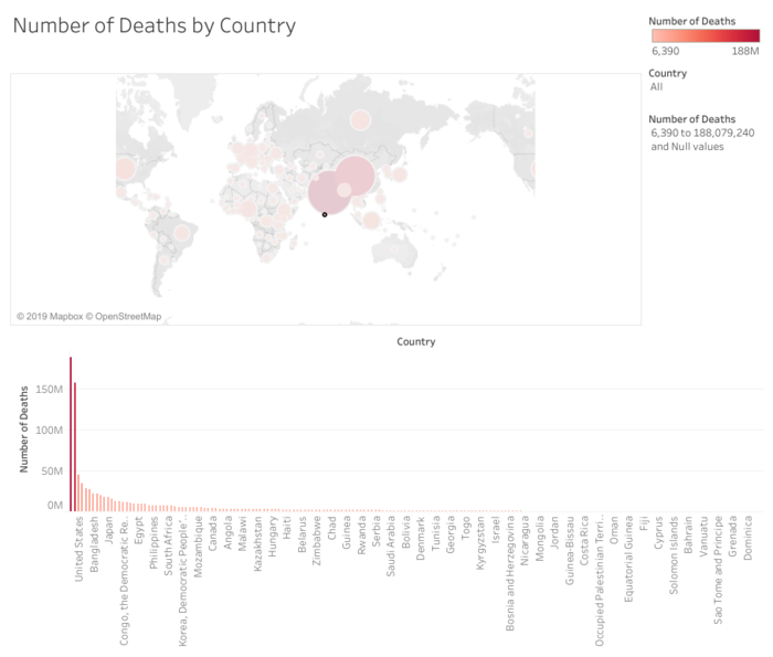
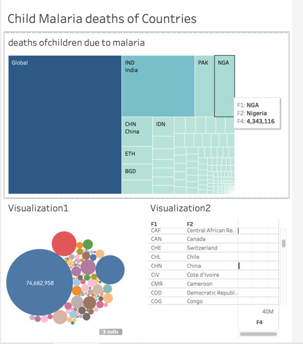
This dashboard shows both a map and a chart of the number of deaths by country. You can use the dropdown menu on the right to select a country or use the bar to drag and only see countries with a specified number of deaths.
Clicking on a the square in top graph will single out the children deaths of malaria disease of a country.
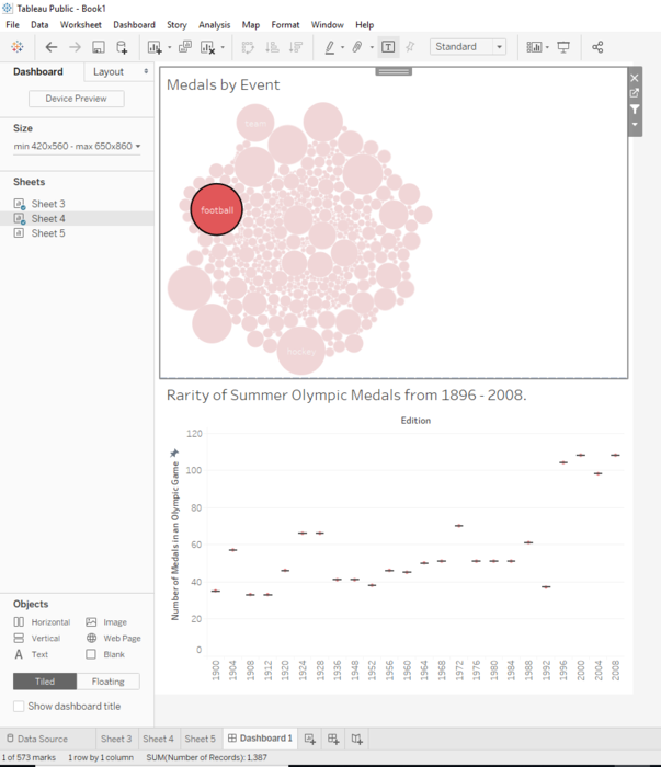
The reverse also works. Hovering over a button on the box and whisker chart will isolate the respective sport in the top graph.
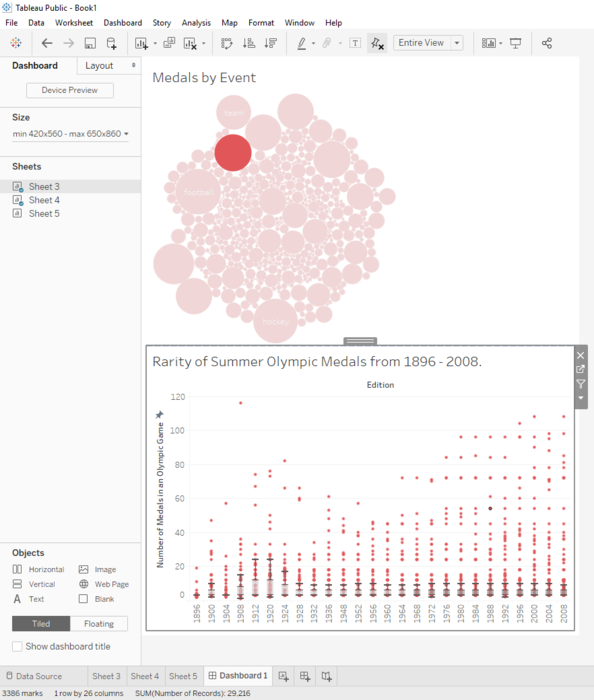
Hovering or clicking on a circle in top graph will single out that point in the bottom graph. Range of y-axis is fixed to provide context.

 jenny-chen
Over 6 years ago
jenny-chen
Over 6 years ago

 josh123
Over 6 years ago
josh123
Over 6 years ago
 mei456
Over 6 years ago
mei456
Over 6 years ago
 sharon-tao
Over 6 years ago
sharon-tao
Over 6 years ago
 brandonyip
Over 6 years ago
brandonyip
Over 6 years ago
 awhale
Over 6 years ago
awhale
Over 6 years ago