Sign up
Sign in
tableau
/
Data-Visualization-Interactive-Dashboard
/
u
/
milly-ma
/
Post #1
milly ma
Tableau Public Interactive Dashboard
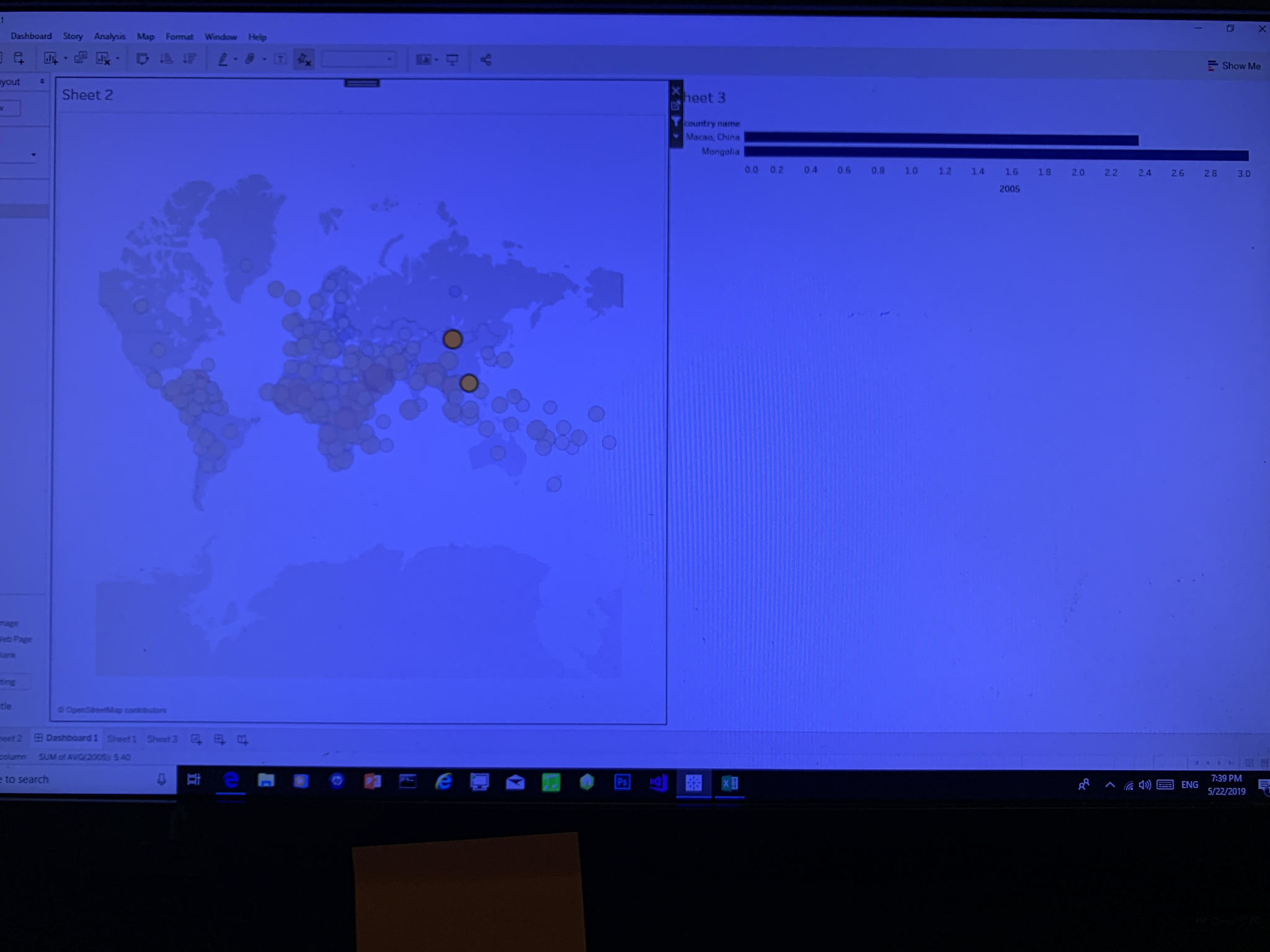
After selecting any two dots on the map, it shows a comparison of annual urban population growth between two countries
May 22, 2019 at 7:42 PM
Last updated over 6 years ago
Visible to public
×
Insert an image
Image URL
Upload an image
Use
PostImage.org
to upload the image
Copy the
Direct Link
to your clipboard and paste it into the box above
Heading
Section
New version available
Refresh
Dismiss

 milly ma