This is my Tableau Public Interactive Dashboard。
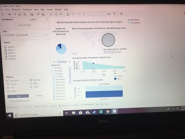
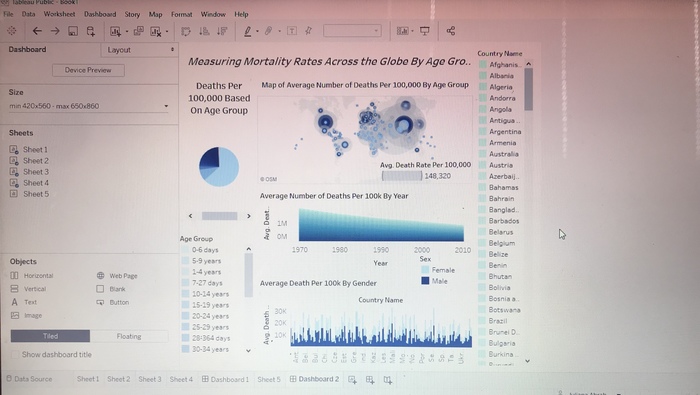
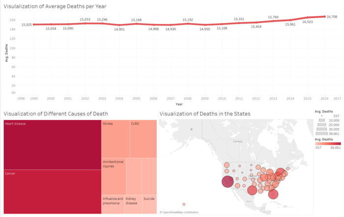
Clicking on the different causes of death causes the other two visualizations to focus on that specific cause of death.
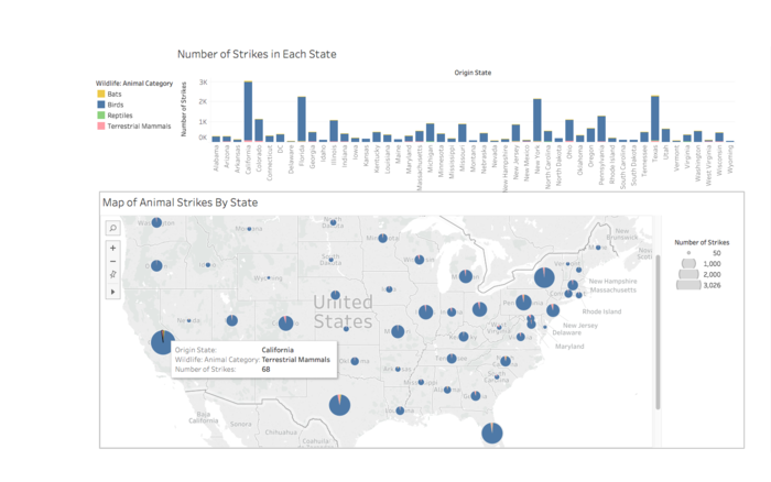
This interactive dashboard shows numbers of animals hit if you hover over a section.
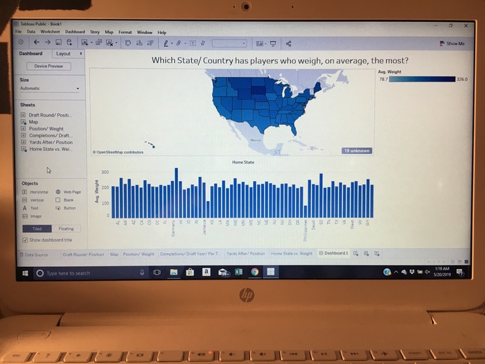
This interactive visualization shows the comparison between the map & chart. It shows how average weight of players differs between states.
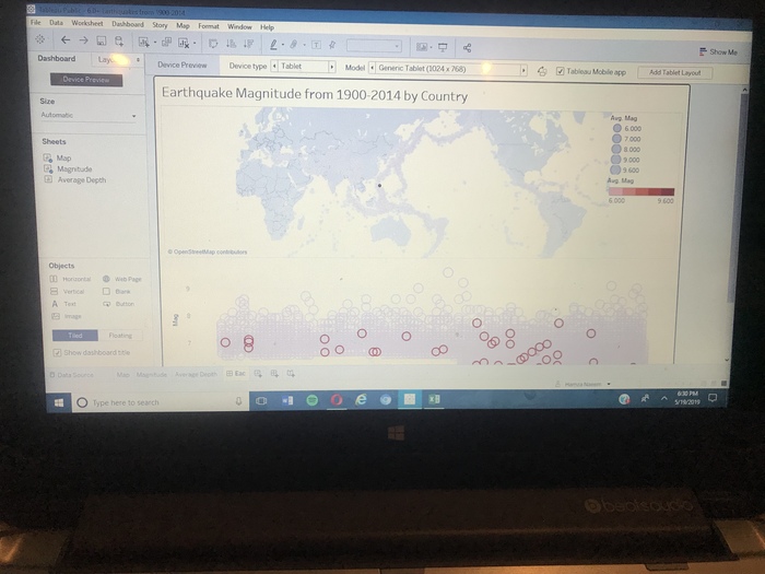
Shows each regions earthquake magnitude ranges from 1900-2014 when clicked a point on the map
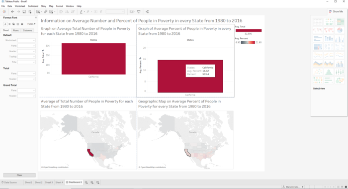
Interactive dashboard will filter a state's data when clicked on a state on the map. Clicking on a state in the average percent of people in poverty will show the data of the state on the poverty percent graph.

 ericlee
Over 6 years ago
ericlee
Over 6 years ago
 alice-z
Over 6 years ago
alice-z
Over 6 years ago
 john_44
Over 6 years ago
john_44
Over 6 years ago
 hamza-naeem
Over 6 years ago
hamza-naeem
Over 6 years ago