Sign up
Sign in
tableau
/
Data-Visualization-Interactive-Dashboard
/
u
/
john_44
/
Post #1
John Sanguinetti
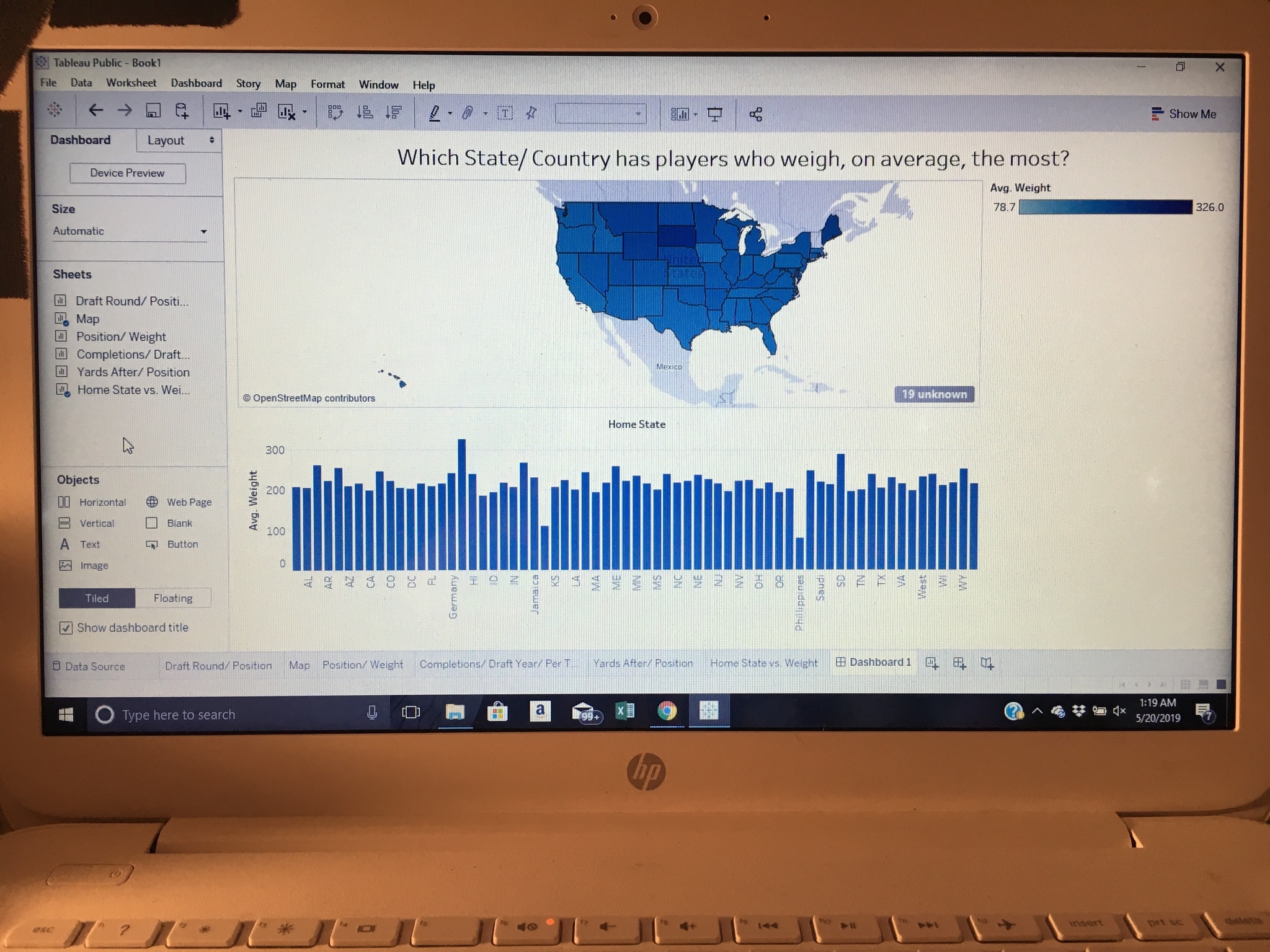
Tableau Public Interactive Dashboard
This interactive visualization shows the comparison between the map & chart. It shows how average weight of players differs between states.
May 20, 2019 at 1:23 AM
Last updated over 6 years ago
Visible to public
×
Insert an image
Image URL
Upload an image
Use
PostImage.org
to upload the image
Copy the
Direct Link
to your clipboard and paste it into the box above
Heading
Section
New version available
Refresh
Dismiss

 John Sanguinetti