Sign up
Sign in
tableau
/
Data-Visualization-Interactive-Dashboard
/
u
/
brandonyip
/
Post #1
Brandon Yip
Tableau Public Interactive Dashboard
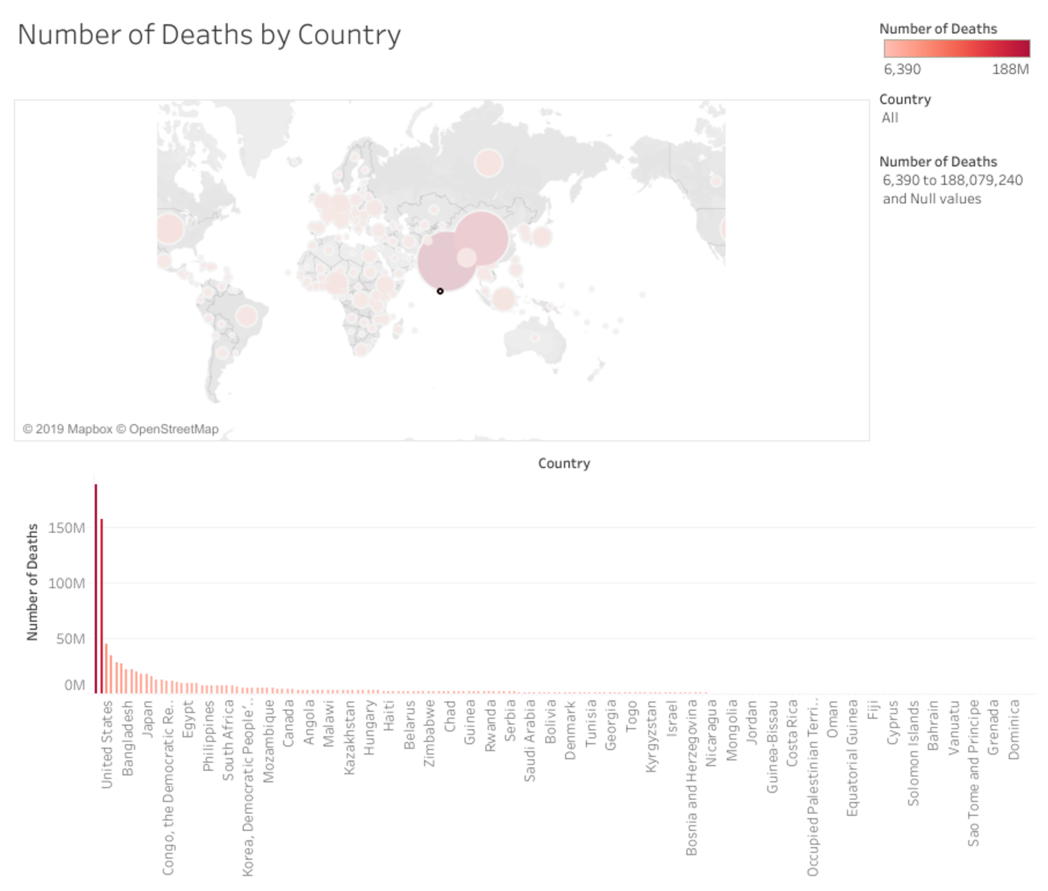
This dashboard shows both a map and a chart of the number of deaths by country. You can use the dropdown menu on the right to select a country or use the bar to drag and only see countries with a specified number of deaths.
May 21, 2019 at 12:22 AM
Last updated over 6 years ago
Visible to public
×
Insert an image
Image URL
Upload an image
Use
PostImage.org
to upload the image
Copy the
Direct Link
to your clipboard and paste it into the box above
Heading
Section
New version available
Refresh
Dismiss

 Brandon Yip