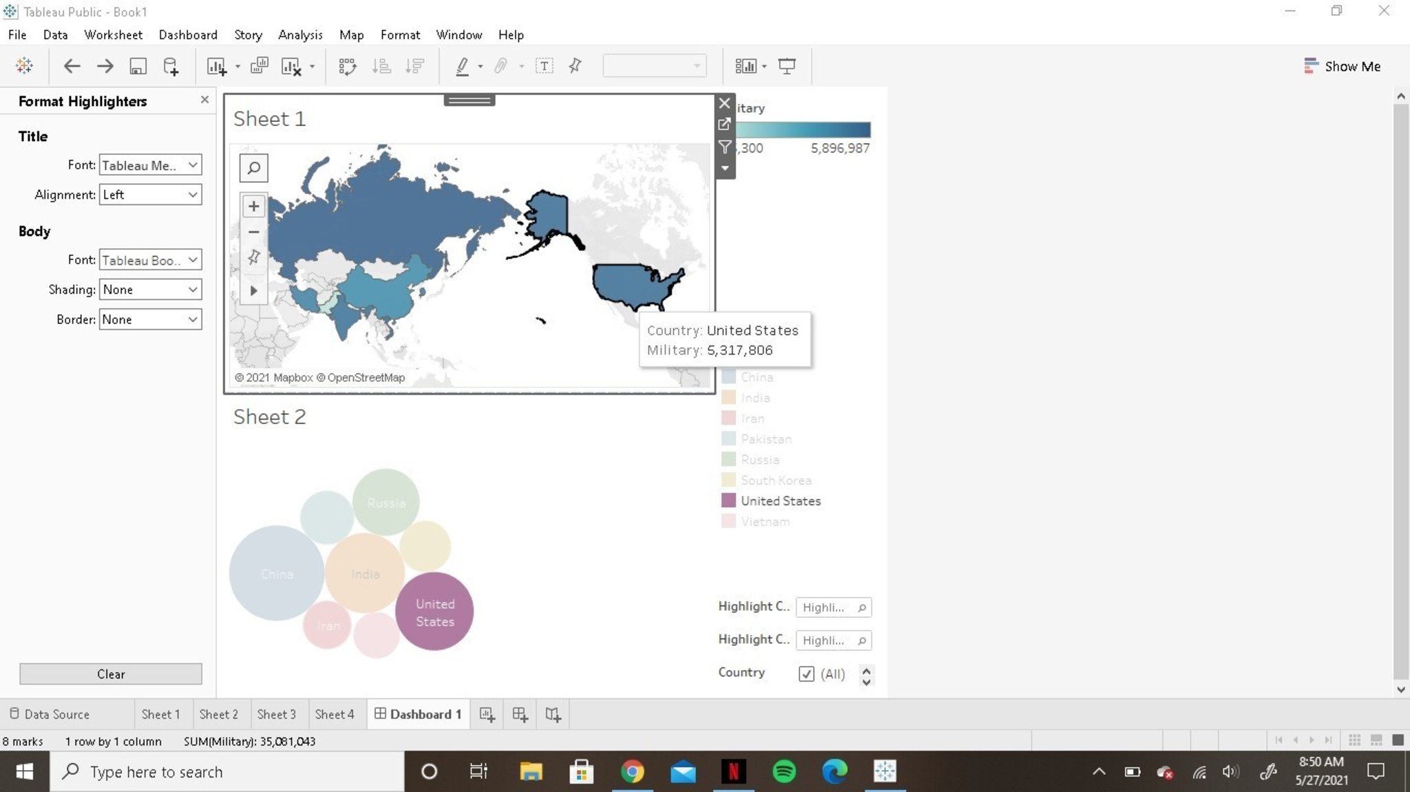
This is an interactive dashboard used to visualize the differences in the size of the active and total military of 8 countries. By hovering over the a certain country in the map a corresponding bubble is highlighted to show the proportion of its active military with other countries.

 Vincent P Aloisio