Sign up
Sign in
tableau
/
Data-Visualization-Interactive-Dashboard
/
u
/
22GuentherA
/
Post #1
Abby Guenther
Tableau Public Interactive Dashboard
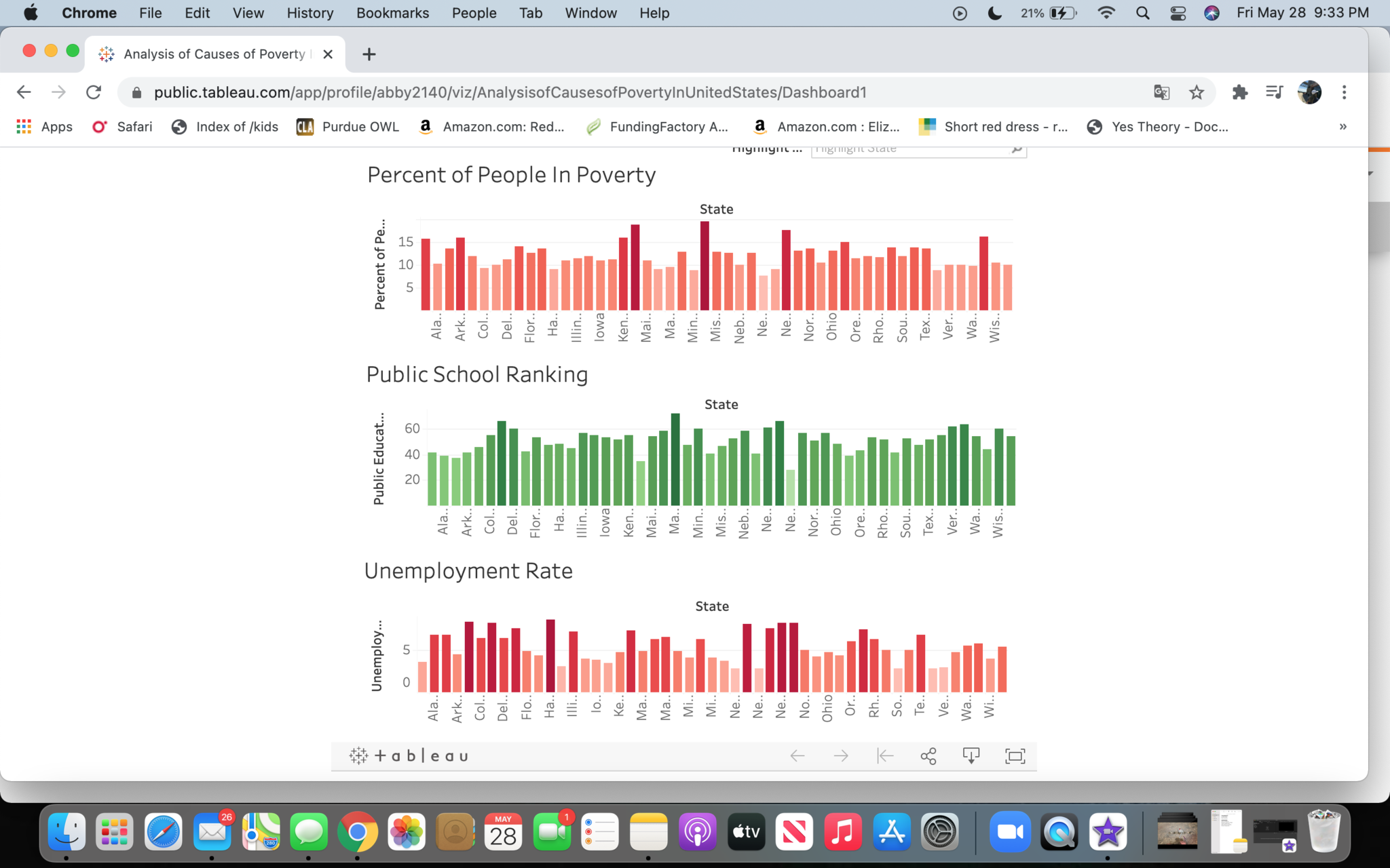
This data shows the correlation between the quality of public schools, unemployment rate and poverty rate in each US state.
May 28, 2021 at 6:34 PM
Last updated over 4 years ago
Visible to public
×
Insert an image
Image URL
Upload an image
Use
PostImage.org
to upload the image
Copy the
Direct Link
to your clipboard and paste it into the box above
Heading
Section
New version available
Refresh
Dismiss

 Abby Guenther